While browsing through the Mox app recently, I noticed the promotional messages could be improved further.


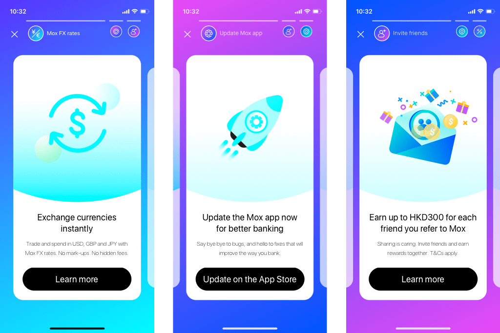
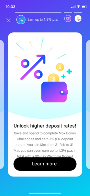
- The title at the top of the screen is truncated.
- The copy could’ve tied back to the email announcement.
- The tile body copy is too long; the last line is partially obscured by the button.
- This button uses title case, but other buttons use sentence case.
- It would be more visually consistent for all tile titles to take 2 lines; the same goes for the tile body.
- The tile title could show both the action and the benefit while the tile body elaborates on the details.
- The tile body copy is too wordy and convoluted, and it doesn’t quite match the more energetic feel that Mox has.


- There isn’t a consistency in how terms and conditions are referred to; it’s ‘T&Cs’ on one tile, but ‘Terms and conditions’ on another.
- The copy could be written in a more snappy way that showcases the youthful image Mox has.
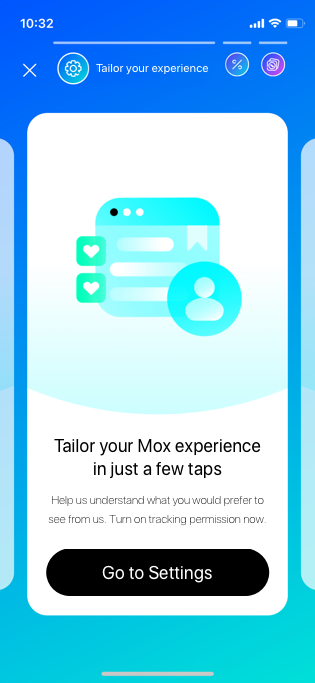
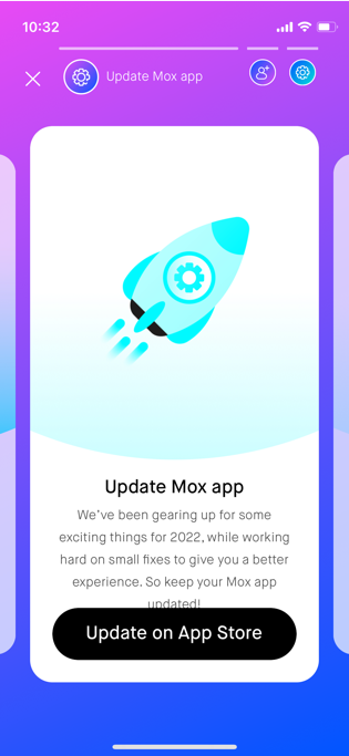
- The title at the top of the screen got cut off again.
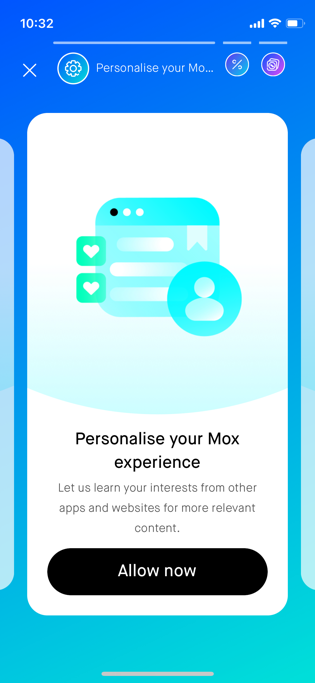
- The copy could be rewritten to show how easy it would be for the user to tailor their experience.
- By asking the user to ‘help us understand’ instead of ‘let us learn’, the user will feel more like they’re doing us a favour by allowing tracking and less like we’re invading their privacy.
- We could also be upfront about what exactly we need from them.
- Leave some of the details to the ‘Learn more’ content instead of trying to stuff it all onto the tile – the tiles are meant to entice interested users into finding out more.
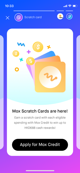

- There’s room in the title at the top of the screen to say what you could do with the scratch cards.
- There’s also space in the tile title to write how much could be won.
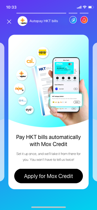
- ‘Eligible spending’ sounds a bit Chinglish; ‘transactions’ would be a better fit.
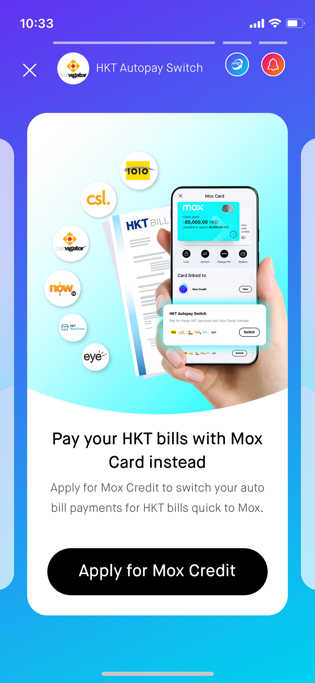
- ‘HKT Autopay Switch’ isn’t explained in detail on the tile, so it’d be better to reword the title at the top of the screen to reflect what’s actually on the tile.
- There’s a grammatical error on the original tile body copy.
- We could highlight how convenient setting automatic payments would be instead of repeating the content that’s already in the tile title copy and the button copy.

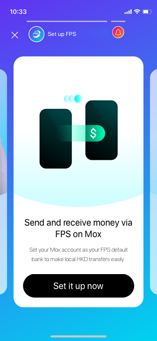
- Users may have already registered for FPS but are not using Mox as their default bank account; so it would be more accurate to use ‘Set up FPS’ in the title at the top of the screen.
- You can send and receive money via FPS, so both functions could be included in the copy.
- Only local HKD transfers can be made so this might be important to add to the copy, since FX is available on the app.
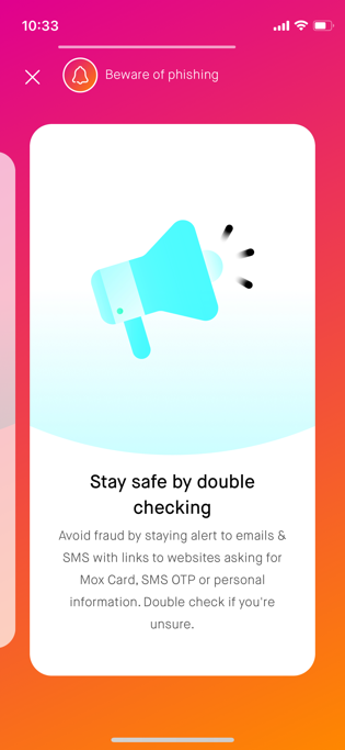
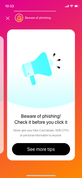
- A more memorable line could be used for the tile title copy, which will also help users to keep the warning in mind for longer.
- I think that given how often scams may occur, it could be helpful to have an in-app page dedicated to tips on safeguarding yourself against fraud and who to contact if someone impersonates Mox.
