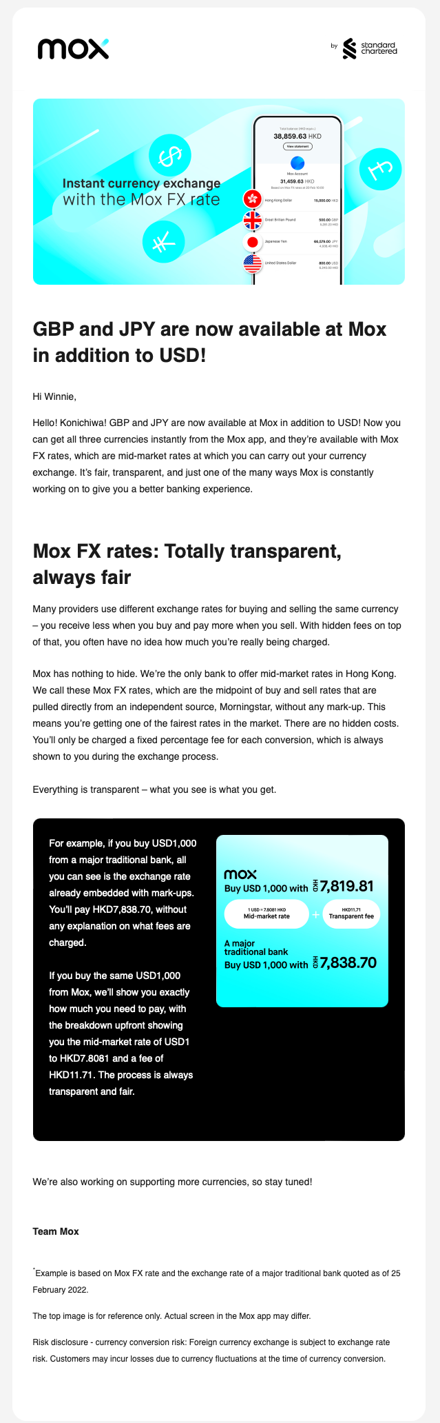
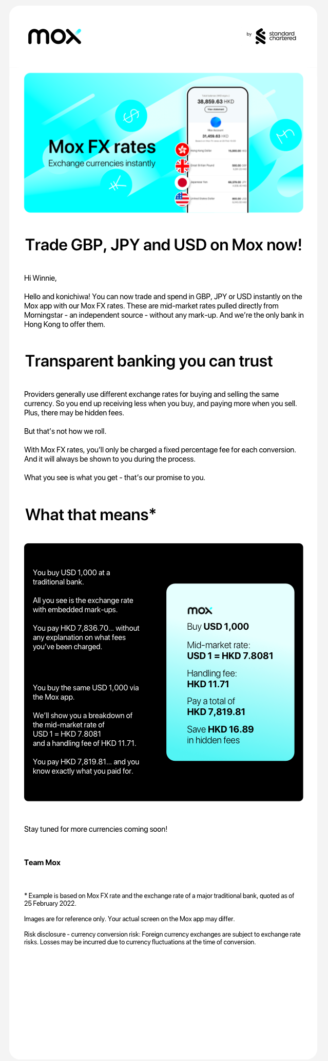
Mox recently introduced 3 foreign currencies to their app. While I understood their announcement, I thought the content and tone of voice could be improved.
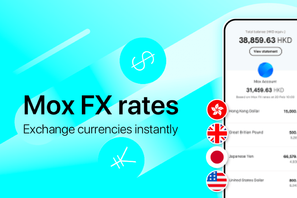
Firstly, I thought that the copy in the banner didn’t sound very engaging. So I put the feature name, “Mox FX rates”, in big bold letters; and wrote what exactly the feature meant for customers right underneath it.
Next, I felt that the headers could be made much more succinct. If they spilt over into 2 lines on a desktop computer, there was a good chance that they would take up 2-3 lines on a mobile device. So I reduced the words used in them.
I also wanted to avoid walls of text in the email body. So I broke sentences down into shorter ones and deleted duplicate content. I made a few rearrangements so that it flowed more logically – it now explains what Mox FX rates are and where they’re pulled from, then how they offer a transparent banking experience.
Lastly, I changed the graphic in the example because the different orientations were distracting, and it was a bit text-heavy. I rewrote the copy given in the example. That made it easier for customers to imagine themselves using Mox FX rates.
