The challenge
Identify areas to improve upon for the existing ‘Assisting someone with their money’ page on the HSBC UK website.
The context
This was part of the Co-pilot programme, a supported banking project that I volunteered for. The first phase of the programme aims to help vulnerable customers – such as those facing illness – with getting the assistance they may need with their banking. While I was initially asked to look at driving outreach through social media strategy, I quickly expanded my scope to content design and growth hacking.
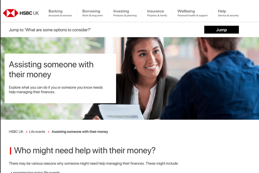
Under this new scope, I looked at our owned media assets to see which pages will need to be updated. That way, we can create multiple entryways across the HSBC UK website to a landing page about Co-pilot. One of the pages that the Project Lead wanted me to work on urgently was the ‘Assisting someone with their money‘ page.
The issues
I noted down some of the issues with the existing page and conducted a preliminary round of user testing on my own. These notes gave me some direction with which I could propose a solution.
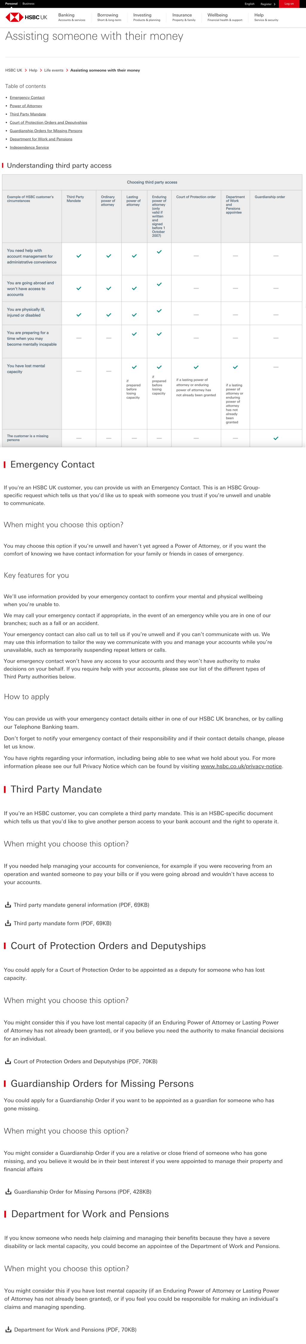
- The meta description of the page does not accurately describe its contents, which can impact how it ranks among similar search results.
- There’s very little context to the table of contents placed at the very top of the page, which offers little reassurance that a reader has come to the right page. The link to ‘Power of Attorney’ led to a completely different page instead of a section on the same page.
- The format was not very visually appealing or interesting.
- There’s also no context offered as to how to read the table. The tester thought that if she faced one of the situations in the table, she would have to apply for all the items that have a green tick.
- The tester also had to constantly scroll back up to refer to the top 2 rows of the table.
- The complexity of the table also meant that it did not display correctly on mobile devices or when the browser window was made narrower.
- The tester felt that the current content would be hard to understand if the reader didn’t understand English very well or if the reader had diminishing mental capacity. The tester also thought that the amount of information shown was overwhelming.
- The perspective used in the copy changes – although the page is titled ‘Assisting someone with their money’, the content largely addresses the reader directly as if they’re the person who needs this assistance. The reader could be a vulnerable customer or their carer.
- It was not always immediately clear when someone should apply for a certain option. Given that Power of Attorney was on a different page, readers might find it difficult to compare it with other third-party access options such as Court of Order Protection.
- Some of the PDF links led to automatic downloads while some opened in a new tab. The tester thought this was annoying and echoed a preference for PDFs opening in a new tab instead of saving onto a device right away.
- Some of the options listed had much more information on the page while others required the reader to look at a PDF document. This made the content look incomplete and inconsistent.
- There was no way to navigate back to the table of contents quickly. The reader would have to scroll back to the top manually.
- Where we ask our customers to call us, a number was not specified. This adds an extra step for the reader as they’ll have to try and find the correct number. It might also lead to more calls than necessary as they attempt to reach the right team who can help them.
The solution (Iteration 1)
User testing feedback for Iteration 1
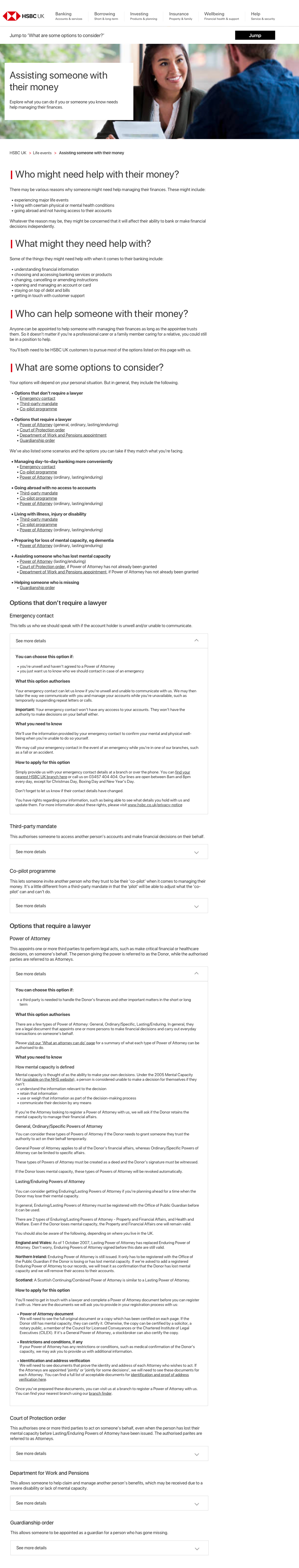
- The page is easier to understand and scan through. Overall, the content looks like it would serve as a good guide or starting point for someone who’s doing some research on their own. The Powers of Attorney section seemed to be clear despite the complexity of the subject.
- The language is simple enough that it can be understood by someone whose primary language may not be English. The tone also seemed warmer and friendlier. The headers also made it easier to scan for the right information to the task.
- The perspective used was neutral and logical enough. It applies well to both a carer or a vulnerable customer who might be looking at the page.
- The use of accordion elements was well-received. The tester highlighted that the brief description before the accordion helped in deciding whether she needed to open it or she could skip it.
- The splitting of the options into ones that do or don’t require a lawyer was appreciated. The tester thought that it was good in offering reassurance if an option didn’t need a lawyer, and in getting the reader mentally prepared if they needed to pursue an option that involves a lawyer.
- The sticky bar offered the ability for the tester to go back to the list of options no matter where she was on the page, so it was highlighted as a positive feature of the proposed revamped content.
- One of the questions that came up in the preparation of the first iteration was whether the options should simply be listed or they should be categorised by scenario (per the original table). A list approach might make it a bit difficult for readers to understand which options they can take at a glance, whereas a scenarios approach might seem limiting. What I’ve proposed is a hybrid approach where we list the options and include some of the more common scenarios that utilise one or more of the options on the page. However, the tester was indifferent to the scenarios approach. Further testing will need to be done to determine which approach is preferred by more testers.
