This is just something that I wrote for fun after having a poke around the Mox by Standard Chartered website.
Mox is clearly a virtual bank that’s built for millennials. This is reflected in its colourful but minimalist look and feel, which suits the idea of a delightful but no frills experience. And this should be similarly expressed in its tone of voice and and approach to copy.
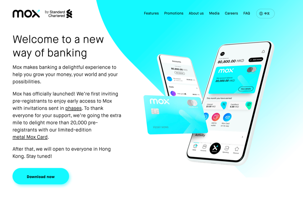
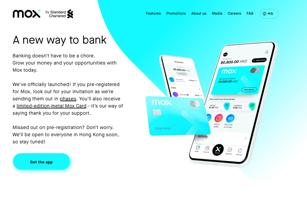
My first impression upon landing on the page was that there was a little too much text above the fold. It made the otherwise clean user interface seem crammed. So I decided to trim the copy down, and this also helped to bring the Get the app button back up above the fold.
Since one of my own burning questions has been “What if I missed the pre-registration?”, I thought it would be better to rephrase the last paragraph so the answer can be picked up by search engines more easily.
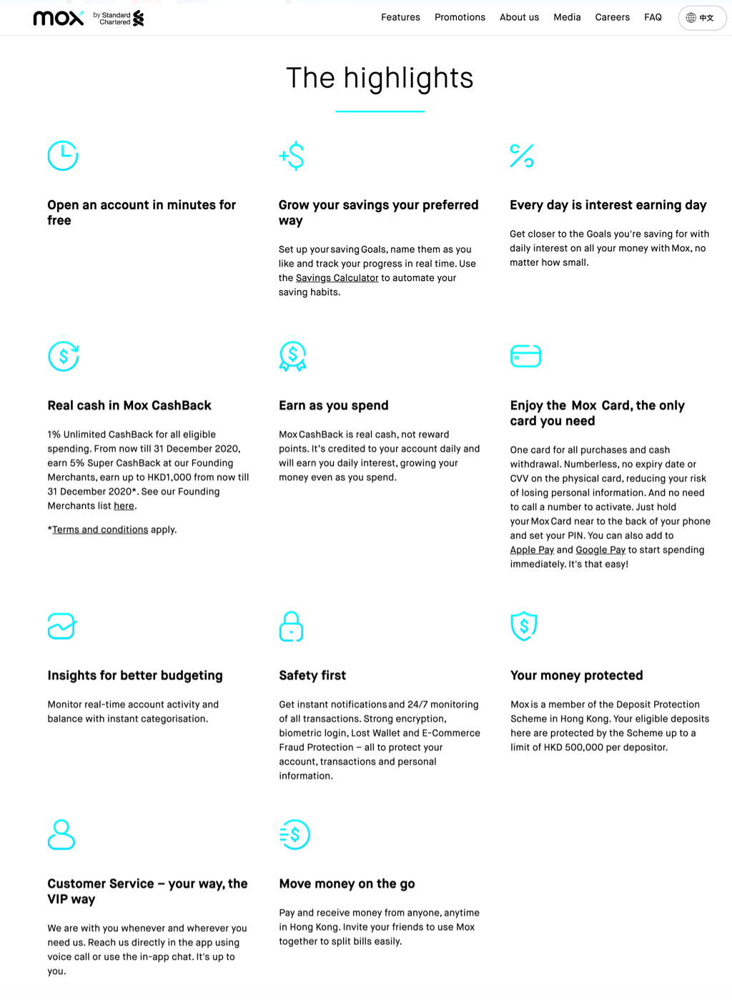
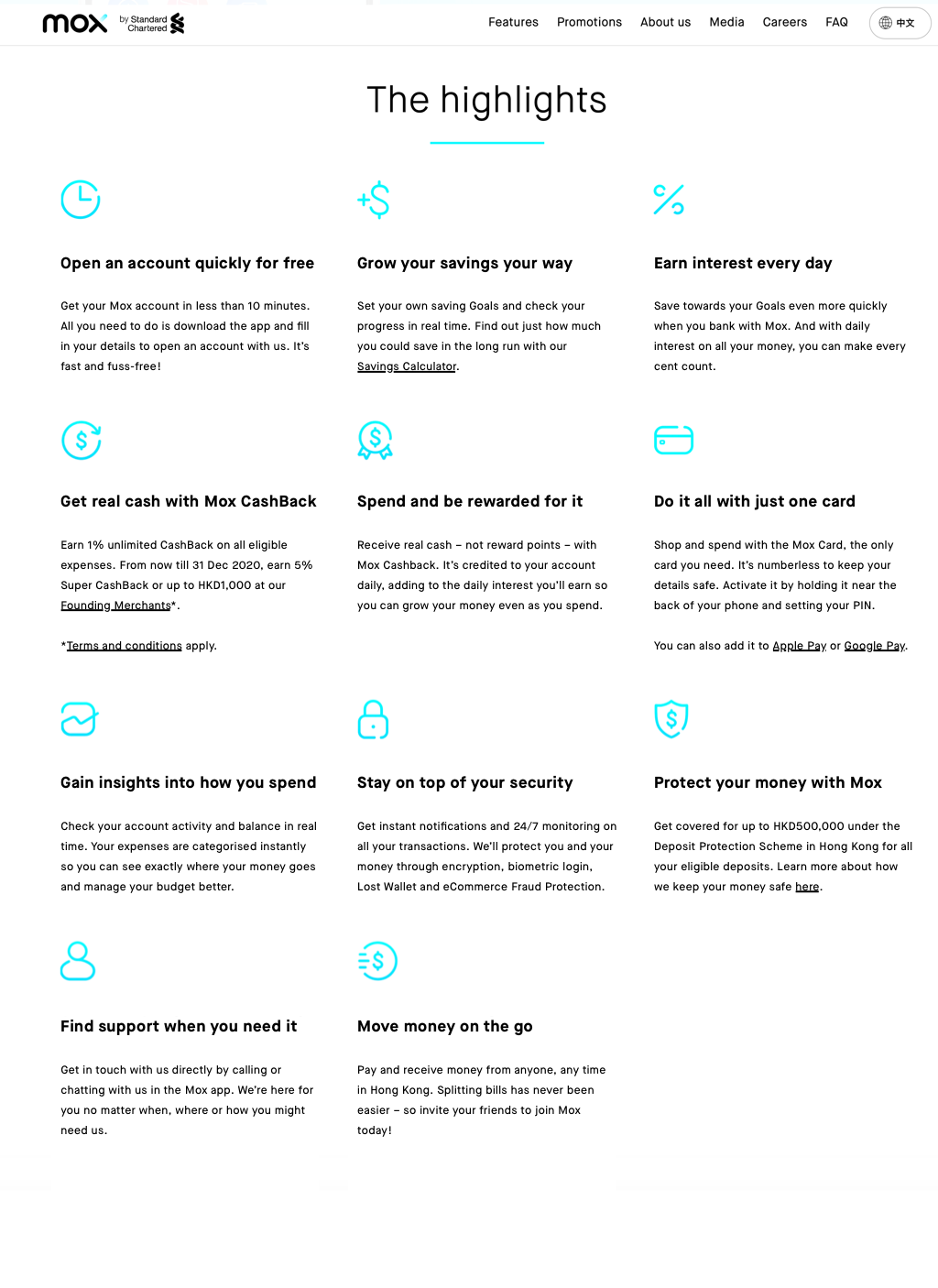
I also had a go at tidying up this page which showcases the features that you can enjoy as a Mox customer. As someone with a design background, it can really bug me when the copy breaks a layout. So I decided to try and keep the header for each highlight to just 1 line, and the description to 4 lines. On the second row, the fifth line is deliberately added away from the paragraph so it draws attention from the user in a subtle way while maintaining a sense of balance to the page.
Starting each header with a verb gave it a sense of action, which can make it a little more engaging to read. Some items have been fluffed out to meet the 4-line requirement that I had set myself, while some have been trimmed down so it isn’t quite as text-heavy. This helps to shorten the length of the page, and minimise the amount of white space between a number of items.
Lastly, I felt that the page would end better with a stronger (and slightly cheeky) call-to-action.