The challenge
Come up with ideas on how to improve the opt-in rate from a copy perspective.
The context
I was asked to have a go at making a few recommendations for this particular screen in the account opening journey. Preferably within the same day so we could roll it out with the next update.
Of course, a few UX tweaks probably wouldn’t hurt, but we were on a time crunch.
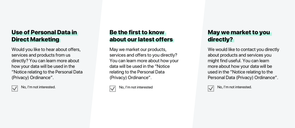
The solution

- Make the benefits the focal point of the copy
- Identify which words the customer might feel negatively about and rephrase them
- Emphasise a freedom of choice
- Add a little FOMO (fear of missing out) to the opt-out copy
The outcome
We saw an improvement of at least 19% within the first few months, just by changing the copy.
