
The challenge
Revamp the PayMe tone of voice to match the app redesign but stay within the HSBC Group guidelines.
The context
Before I joined the team as a copywriter, different colleagues would write the copy depending on whether the need arose from a marketing, business or design need. That unfortunately resulted in our tone of voice being inconsistent, often swinging between being too playful and too corporate, depending on the writer.
Since we were revisiting the design, we took the opportunity to take another look at the copy. Instead of guesswork, we conducted research surveys and workshops so we could understand what our users expect.
Initial feedback from our users was often conflicted. In a way, it mirrored our status as a modern app from a legacy bank. But the consensus was:
- the copy should explain things to the users more clearly
- the tone of voice needed to strike a more consistent balance
It may not have been much, but it gave me a good starting point for where to make improvements.
The solution
Our UI designer defined the design principles for the redesigned PayMe as social, simple, delightful, young and focused. I decided that the copy direction needed to mirror that. Because if we didn’t take them into account, we may end up with a mismatch between the design and copy.
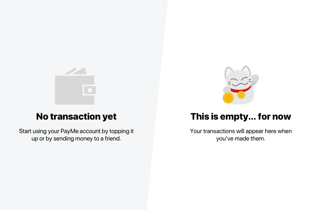
- Social: speak like a human
- Simple: be clear when giving instructions
- Delightful: insert wit where appropriate
- Young: speak on our users’ level
- Focused: be concise with what we write
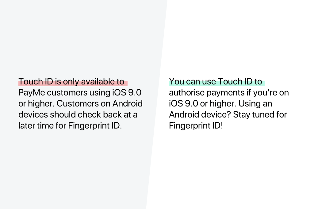

Next, we had to set clearer guidance for finding the right mix between casual and corporate. Instead of focusing solely on the tone, I recommended that we consider the channel and situation more. By putting ourselves squarely in our users’ shoes, we’ll find it easier to understand the combination of tonal values they expect from us. For example, a service outage email should sound more corporate than an email announcing a new feature.
Another important item to work on as we reassessed the way we should approach copy for PayMe was making sure we write the terms we use in a consistent way. We did this by amassing an extensive glossary of standard terms used in PayMe, and noting down the rationale behind the terms we choose to write with.

- Use simple terms that your users can understand easily
- Keep them succinct
- Minimise the use of any jargon
- Avoid ambiguous terms that might cause confusion
We also curated a library of emojis that we can use, and laid down guidelines on avoiding emojis that could have political, religious, negative or suggestive connotations, or those that feature drugs, violence and alcohol. Next, we set a limit of having no more than three emojis per piece of communication, whether that’s per screen, email or header.
The outcome
It’s always an honour to hear other teams across HSBC cite PayMe as the direction they’d like the copy for their projects to take, even 2 years after I left the PayMe team.
Extra
The illustrations you see on this post are my (lousy) attempt at recreating our UI designer’s work.
