The challenge
Humanise error messages so they offer a more helpful and delightful user experience.
The tone of voice
I started by looking at the design principles for the new PayMe, which included being helpful, delightful, young. Next, I looked at the HSBC Group tone of voice, which was human, insightful, confident and witty.
After mulling all our design and communication materials, I ultimately recommended a tone of voice that mirrored the Group tone of voice closely but had a more youthful and casual edge to it that reflects the design.
The solution
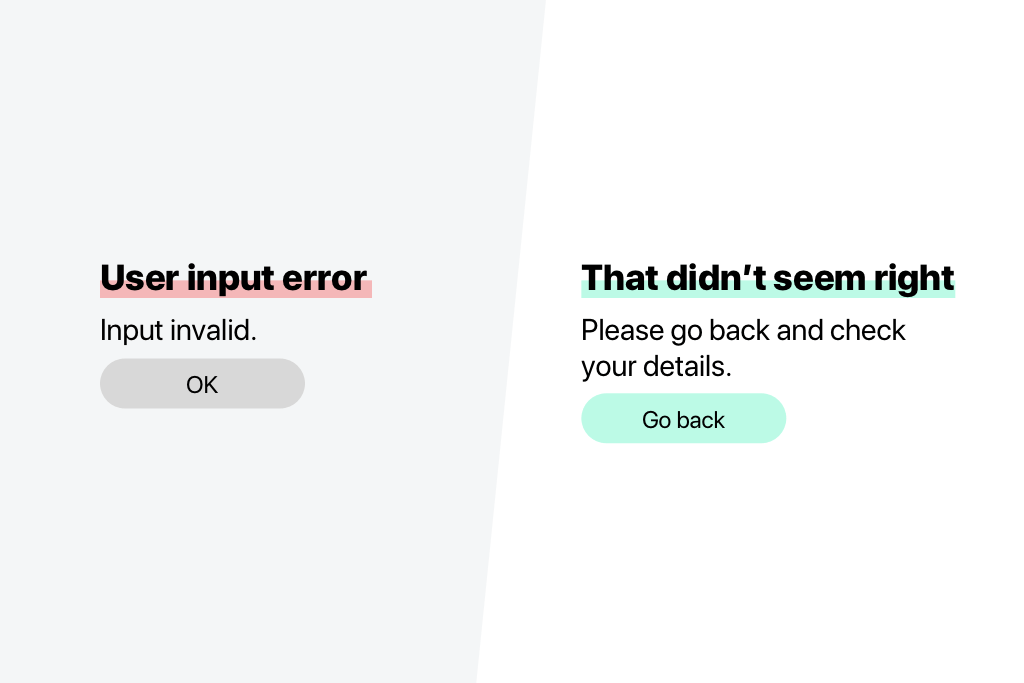
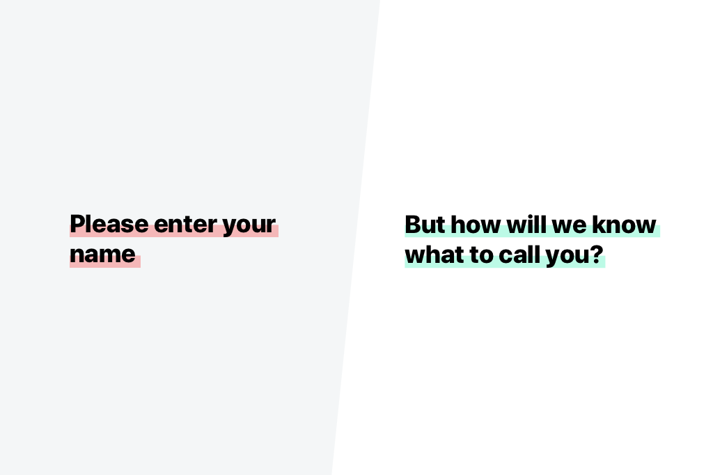
- Remove jargon
- Apply tone of voice
- Have an actionable call-to-action
- Use mirroring language for clarity
- Ensure that the copy is not tone-deaf
- Reassure the user
- Guide the user on what they can do
- Keep it positive
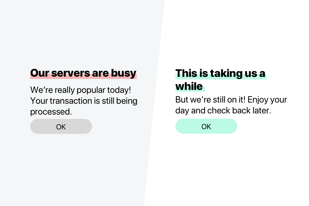
- Adjust the copy for tone of voice
- Do away with the jargon
- Align the copy with tone of voice
- Include what the user can do
- Make it more casual
- Add a touch of cheekiness
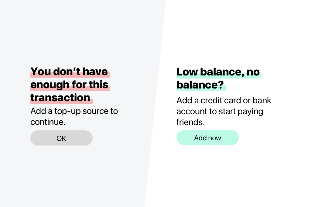
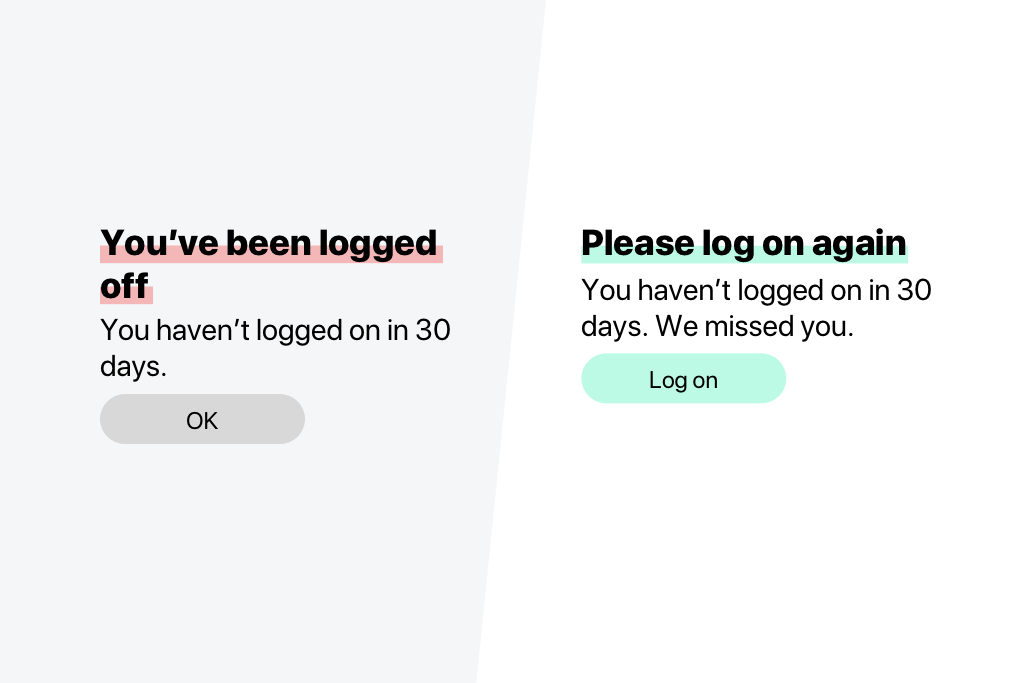
- Specify what a “top-up source” might be
- Use “friends” to refer back to the app’s social aspect
The outcome
Clearer error messages meant that the overall experience was more positive, which helped to improve brand perception.
Extra
As the only copywriter at PayMe at the time, I created copy for PayMe as well as PayMe for Business. In my tone-of-voice toolkit, I took care to note that while PayMe should speak to a user as a friend, PayMe for Business should speak to a user as an assistant. While the distinction may seem small, it could have big ramifications for how a user may perceive the two products.
